Most quizzes we take usually end in the way: a “Thank you for completing our quiz” message and nothing else. I find that there is no result remembering, no next step and basically no reason to be interested in their website. For the person who just finished a quiz that is the end of the experience so what the person does is close the tab and move on.
This is a missed opportunity, as right the next moment after someone completes a quiz is one of the most engaging parts of the journey on your site. They’ve spent time, attention, and resources on your website, and the results at least should have been something that will be worth remembering and special only to your website. Something that will be a great solution for this is a well-designed thank-you page that will raise curiosity and will make people explore more content, sign up for something else, share their results, or even want to complete another quiz on your site. A generic confirmation message will just close this door.
In this guide, we will show you what a quiz thank-you page actually is, why it’s worth having, and how to design one.
What Is a Quiz Thank-You Page?
A quiz thank-you page refers to the page or the message that someone sees after finishing a quiz. Let’s not confuse the term “thank-you page” with other similar terms. We need to distinguish between these three even though they are kind of interrelated.
- A thank-you message is a short confirmation, sometimes just a line of text or a pop-up animation, that informs the user they successfully completed the quiz.
- A quiz results page is the screen showing the outcome of the quiz; this can be a score, a personality type, a product match, and basically whatever the quiz was built to reveal.
- A dedicated thank-you page is the page the user is redirected to after finishing, built specifically to guide them toward a next step, for example, logging in to another website.
Why Does Your Quiz Thank You Page Matter?
1. Confirms Quiz Completion
The most basic thing the users need to know is whether their answers were actually submitted or not. The thank-you message will automatically solve this issue.
2. Keeps Users Engaged
Finishing a quiz is the natural moment to leave the site, meaning that once you complete it, you want to leave the site. Without a reason to keep browsing, most users leave. An attractive thank-you page gives them somewhere to go next instead of closing the tab.
3. Creates a Better User Experience
A generic “Thanks!” feels like an afterthought bolted onto the end of a quiz. A page that reflects the specific user’s answers, tone, and result feels like part of the same experience — intentional and not automated.
4. Supports Lead Generation
Thank-you pages can point toward newsletter sign-ups, free resources, consultation bookings, or content, all of this while the user is still interested.
5. Increases Conversions
The thank-you page is where the action happens, whether it’s a purchase a download or a booked call. People who just finished a quiz about your product or service are already more interested. They’re more qualified than a visitor. That’s why the thank-you page is the spot to guide them toward the next step. It’s the moment to make it happen.
What Should You Include on a Quiz Thank You Page?
1) A Clear Thank-You Message
Keep it short. Thank the user that they took the time and effort to finish the quiz.
2) Quiz Result
Let’s say the user took an English language exam; the logical result would be to show the user what score they got, or, if it’s a personality quiz, show the user what type of personality they got. Basically, say, if your quiz promised any type of matching, this is the place you should show that match in an entertaining way. If you’re interested in creating online exams using the Quiz Maker plugin, check out this article.
3) Personalized Message
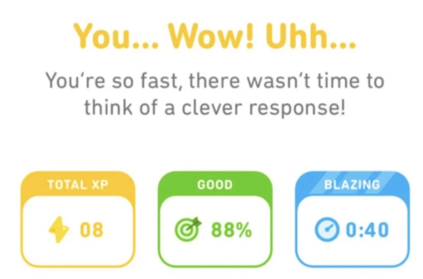
Every time I finish my Duolingo class, I get this: “You completed the class in under 1 minute.” These messages make me feel very good, and I screenshot each of these every time because they’re very personalized and make the user/reader feel special.
4) Relevant CTA ( Call to action )
Give users one clear thing to do next. A few examples:
- Explore Your Recommended Products
- Read More
- Download Your Guide
- Start Another Quiz
- Book a Consultation
- Subscribe to Our Newsletter
5) Social Sharing
For personality, knowledge, or entertainment quizzes, a share option lets users show off their result, like screenshot those and post on their social media.
6) Additional Resources
Point toward relevant blog posts, guides, courses, products, or services connected to the quiz topic or the user’s result.
How to Design a Quiz Thank You Page in WordPress
Step 1: Install and Activate Quiz Maker plugin
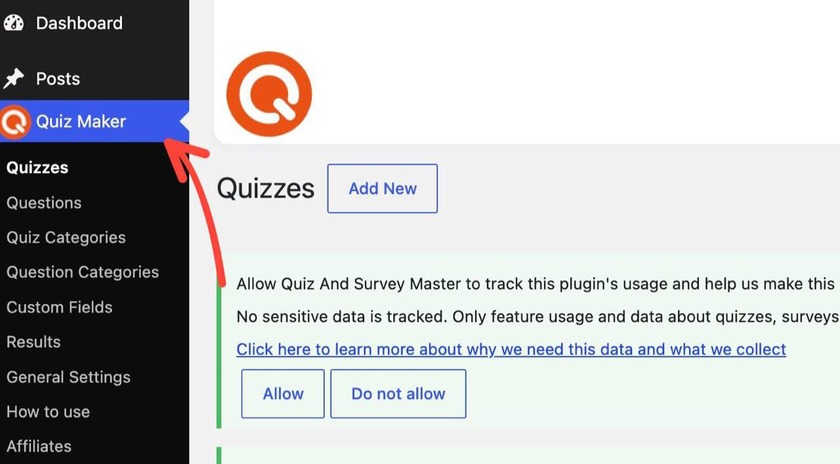
The first step is to have the Quiz Maker plugin installed and activated on your WordPress dashboard. Once it’s active, a new Quiz Maker tab will show up in your left-hand sidebar.
Step 2: Build the Quiz
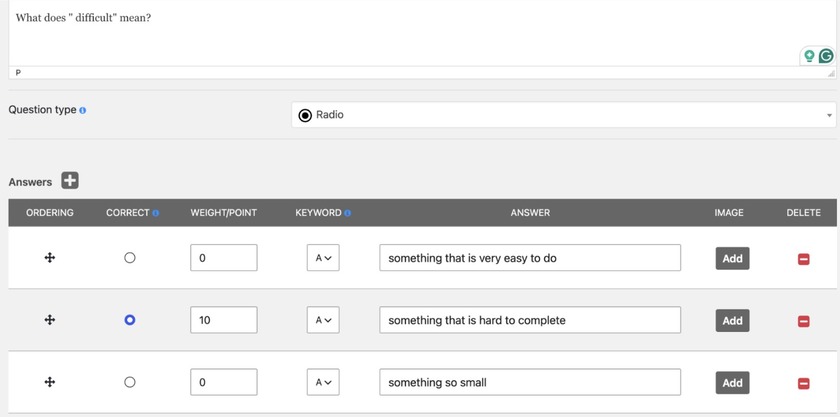
In the Quiz Maker tab, click Add New to create a quiz. Add your questions and answer options as usual. For a score-based quiz (educational, assessment-style), you’ll assign point values to answers. For a personality or matching quiz, you’ll tag answers to specific result categories instead. Quiz Maker by AYS suggest many types of questions types you can choose from, here you can get to know them.
Step 3: Define Result Types or Score Ranges
This is where the thank-you page experience is actually happening.
Under the quiz’s settings, find the Results section.
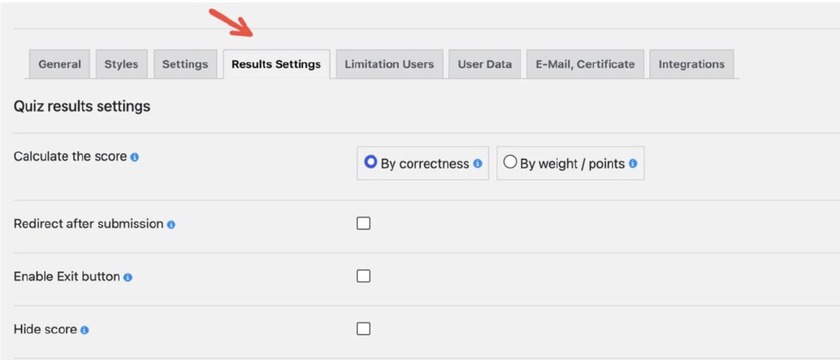
If it’s score-based, you’ll set up ranges; let’s say it’s an English language test, set up score ranges tied to English proficiency levels, for example:
- 0–4 points – Beginner
- 5–7 points – Intermediate
- 8–9 points – Advanced
- 10 points – Fluent
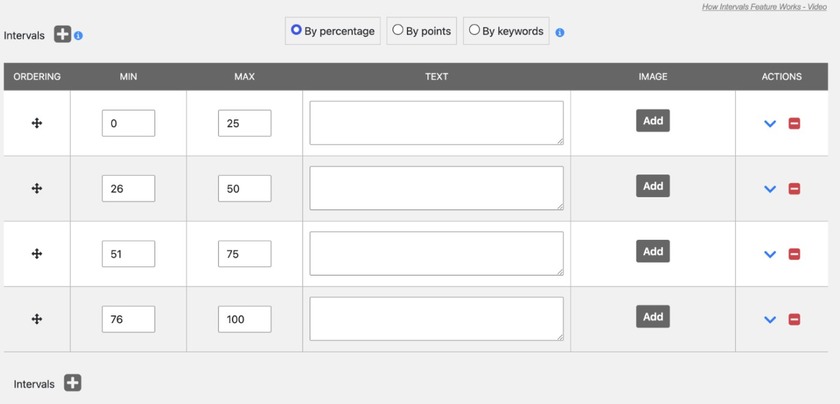
Step 4: Write the Result Message for Each Level
This is the actual time we’re going to put the messages and even add the images we want. Below, you can see an example of the English language test we did earlier.
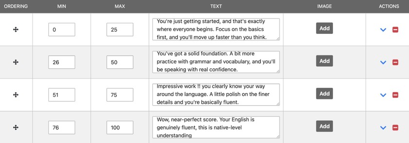
Here you can see how I put my desired text next to the specific score range.
Step 5: Add a CTA
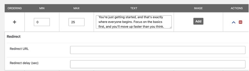
Still inside the same section, click on this little arrow
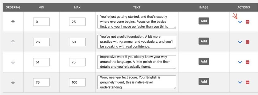
After clicking the arrow, you will see this, here you can easily add your call to action and a link that users will be redirected to.
Step 6: Preview and Test
Before publishing, use the Preview button to run through the quiz yourself, checking everything. This is an important step not only in this particular case, but every time you make a quiz, it’s important to check before publishing.
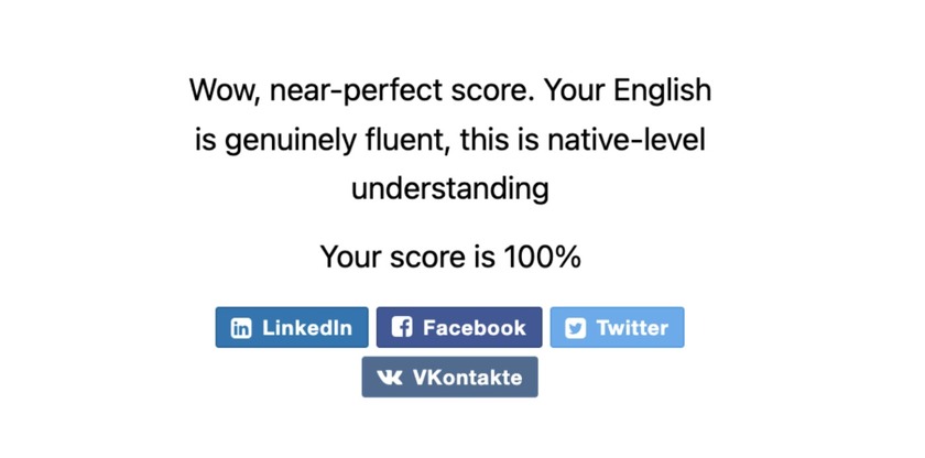
And this is our final result; look how interesting it is to get a personalized message like this after completing a quiz.
Matching Your CTA to Your Quiz Type
Design isn’t about how the page looks; it’s also about whether it gets the right people to take the right action. That starts with making sure the call, to action matches the type of quiz:
| Quiz Type | Recommended CTA |
| Product Recommendation Quiz | Shop Recommended Products |
| Personality Quiz | Share Your Result |
| Educational Quiz | Explore the Next Lesson |
| Lead Generation Quiz | Download a Free Resource |
| Assessment | View Detailed Results |
A product quiz that ends in “Subscribe to Our Newsletter” wastes the moment. So does a lead-gen quiz that just says “Thanks!” with no download link. The CTA should be the obvious next step given what the user just did, not a general default one.
Quiz Thank You Page Examples
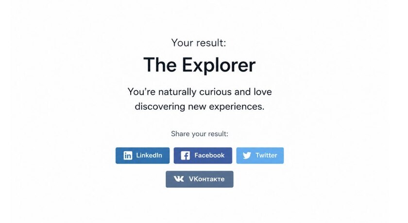
Example of Personality Quiz
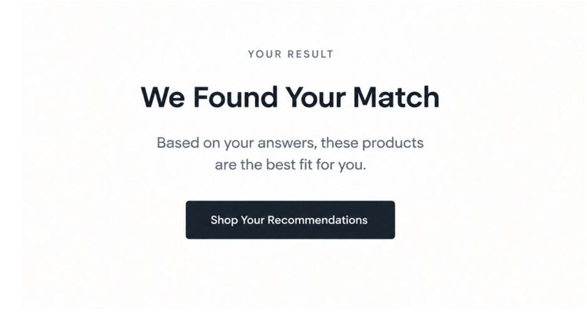
Example of Product Recommendation Quiz
Thank You Page vs. Results Page: What’s the Difference between these two ?
| Results Page | Thank You Page |
| Shows quiz outcome | Confirms completion |
| Focuses on the user’s score/result | Focuses on the next step |
| Common in personality/knowledge quizzes | Useful for almost any quiz |
| Can contain personalized feedback | Can contain CTAs and resources |
| Answers “How did I do?” | Answers “What’s the next step?” |
These two are not mutually exclusive. I see that many quizzes combine them into a post‑quiz screen. Quizzes show the result then immediately follow it with a step.
Quiz Thank You Page Best Practices
Keep It Simple: Do not overwhelm users by giving them many options. One good next step is more than enough.
Make the Next Step Obvious: Use one CTA; secondary links are also fine. There should be no confusion about what you want the user to do. The primary CTA must stand out so the user knows what to do next; it should be clear and easy to find.
Personalize Where Possible: Always reference the user’s result the user’s score or the users specific answers whenever quiz logic allows it.
Maintain Your Branding: The completion screen should look and sound like the rest of your site, not like a separate one.
Optimize for Mobile: A large share of quiz traffic comes from mobile. Test the full completion flow on a phone, not only on a desktop browser.
Don’t Hide the Result: If your quiz promises a result, deliver it clearly and immediately.
Give Users Something Useful. The page should offer value like a resource, an answer, or a next step.
Common Quiz Thank You Page Mistakes
- Showing only a generic “Thank you” message
- Having no CTA at all
- Adding too many competing CTAs
- Making the page difficult to navigate
- Not showing promised results
- Ignoring mobile users
- Using irrelevant recommendations
- Sending users to a generic homepage instead of something relevant
- Forgetting to test the completion flow before launch
How Quiz Maker Helps Create Better Post-Quiz Experiences
Quiz Maker by AYS is one of the best quiz maker plugins on the market.
Everything we covered in this guide, including score ranges, personalized messages, redirects, CTAs — is something Quiz Maker by AYS Pro does natively, without touching a line of code.
Here are some of the main features of this plugin:
1) Has 10+ question formats, like multiple choice, dropdown menus, short text answers, true/false, and more
2) A free version exists too, covering the core features if you’re low on budget. Get to know plugin’s pricing by clicking this link
3) You can build as many quizzes, questions, and answer options as you want.
4) Organize questions into banks by category and randomize them automatically
5) Pro version adds certificates plus in-depth reporting and analytics
6) Set up product-recommendation quizzes that connect directly to WooCommerce
7) The Pro version can also connect to 15+ marketing and email tools, like Mailchimp, Google Sheets, Slack, and others
A quiz shouldn’t end the moment someone clicks submit. That’s the point where a visitor is most engaged and most curious about what comes next — and a generic “thanks for playing” message wastes it.
A good thank‑you page does three things: confirms that the quiz was completed, gives the user something of value, and points the user toward a next step.
If you’re building quizzes in WordPress, Quiz Maker gives you the tools to design that full experience, including results, messaging, and CTAs, so your quiz doesn’t stop delivering value the second it ends.